Product/UX Design | Noggin - SaaS platform
Design & Strategy
Design Gallery
Expense Splitter: Research & Design for an application to split social expenses
A modular, user-centered redesign that transformed usability and adoption for Noggin, the award-winning resilience and incident management software trusted by leading organizations.
Design Approach
The Challenge
Westpac’s previous attempt at an expense-splitting feature had failed in user testing, with customers finding it unintuitive and frustrating to use. Splitting costs with friends is a common social scenario, yet the original app struggled to match how people naturally think about dividing expenses, leading to confusion, drop-offs, and low engagement.
My role as Lead UX Designer was to reimagine the experience from the ground up, validating the mental model behind expense splitting and ensuring every interaction felt simple, logical, and user-friendly. Rather than restarting the research process, I built on the foundation laid by the former team, reviewing insights, personas, and pain points, then worked closely with stakeholders to create a concept that felt effortless and natural for users. The goal was to deliver a feature so seamless that customers would trust it as part of their daily banking experience and use it also as a stand-alone application.
My Role
As the Lead UX Designer on a cross-functional agile team of 6, I was responsible for:
Reviewed research, personas, and created a timeline
Worked on a new concept with clients and a fitting mental model
Workshopped and reviewed the concept internally
Was paired with a Visual Designer and created story boards, user stories with a Business Analyst and first wireframes
An external agency tested the prototypes on 15 Westpac customers
After successful testing, I was placed in the dev headquaters presented it’s functionality and oversaw the development of Expense Splitter
Delivered an application (stand-alone and integrated into mobile banking) that has since become an embedded functionality of Westpac Banking.
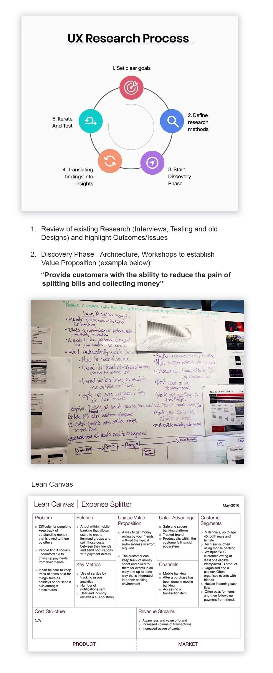
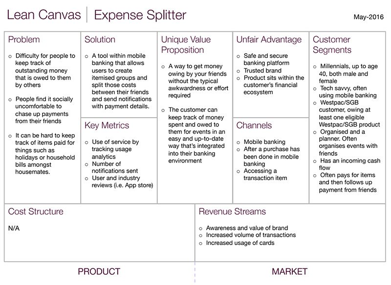
Review of research, workshops & Lean Canvas
To build clarity and confidence in the direction of Expense Splitter, we ran focused internal workshops to align on the core problem, the solution space, and the unique value proposition. These workshops brought together product owners, designers, and BAs to map user journeys, pain points, and success metrics early on.
We leveraged the Lean Canvas framework (shown on the right) to distill insights into a single, actionable snapshot. This helped the team clearly articulate the business opportunity, define measurable outcomes, and highlight the app’s unfair advantage as a secure, bank-integrated solution.
To complement internal alignment, we conducted five in-depth user interviews with Westpac customers to explore the emotions and real-life scenarios tied to splitting expenses. Themes quickly emerged:
The awkwardness of asking friends to repay money.
A desire to pay upfront for a group without losing track of costs.
The need for visibility and transparency on repayments.
Frustration with manual tracking and scattered communication.
This upfront discovery work ensured we weren’t just designing a feature, but addressing a deeply emotional problem with a tool that customers would trust and enjoy using.
Results were presented to stakeholders and product owners regularly, and agile team stand-ups were held every second day to ensure tight collaboration and quick iteration throughout the process.
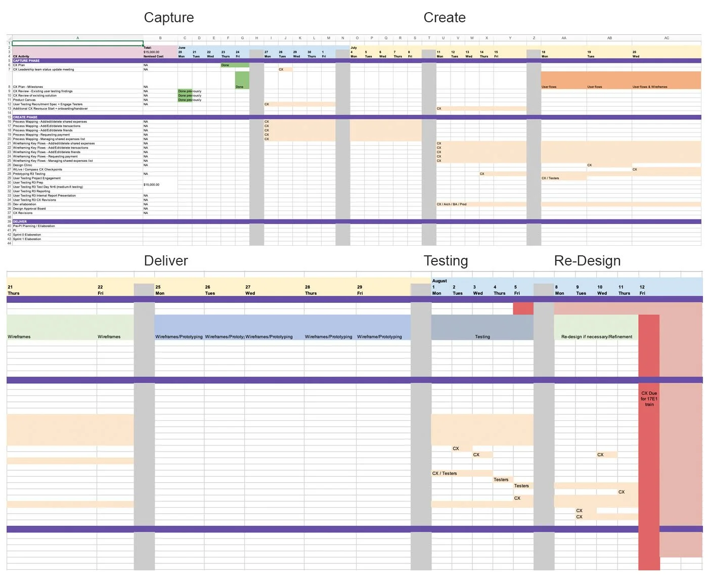
Planning & Alignment: Timeline
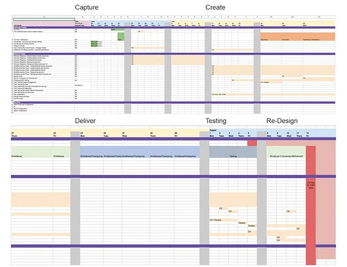
Alongside the Discovery phase, one of my priorities was to create a realistic, actionable project timeline that would align research, design, and testing activities while respecting the constraints of my limited engagement at Westpac. I mapped out clear phases: Capture, Create, and Deliver to ensure we could gather insights efficiently, iterate quickly, and meet delivery deadlines without sacrificing quality (see below).
The Capture Phase focused on reviewing existing research, synthesizing findings, and recruiting testers to establish a solid foundation. In the Create Phase, we conducted process mapping, wireframing key user flows, and holding design clinics to iterate on solutions based on early feedback. Finally, the Deliver Phase concentrated on final prototyping, refinement, and preparing the app for integration into the mobile banking platform.
This timeline became a shared source of truth for designers, business analysts, and developers, helping everyone stay aligned on milestones and reducing the risk of bottlenecks. It also gave me a structured way to deliver maximum impact as a consultant within a compressed timeframe.
Timeline
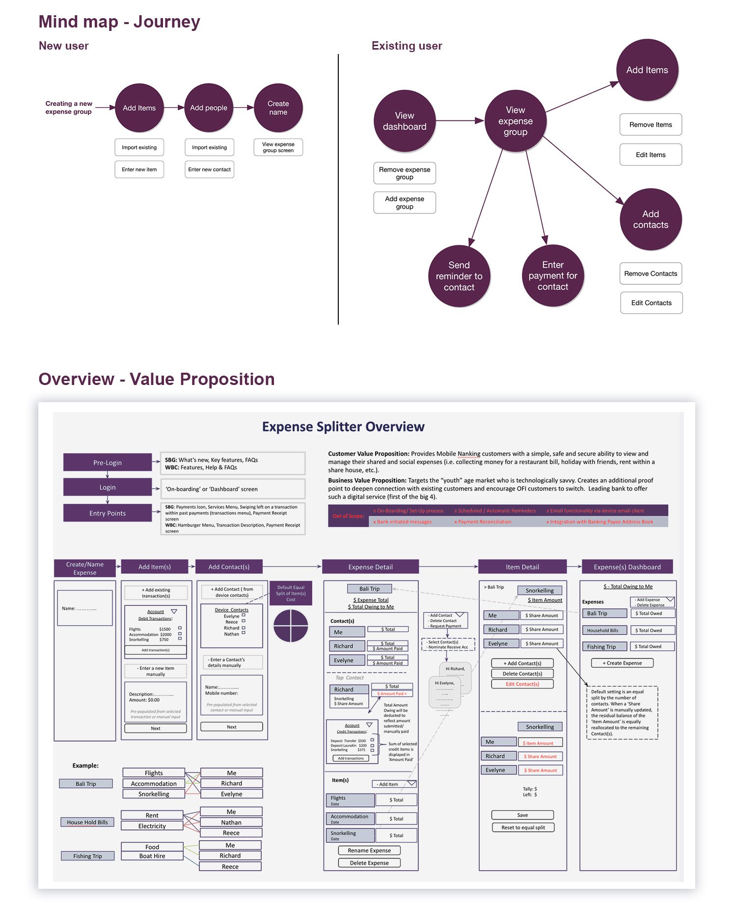
Design Process - Mapping the User Journey and Value proposition
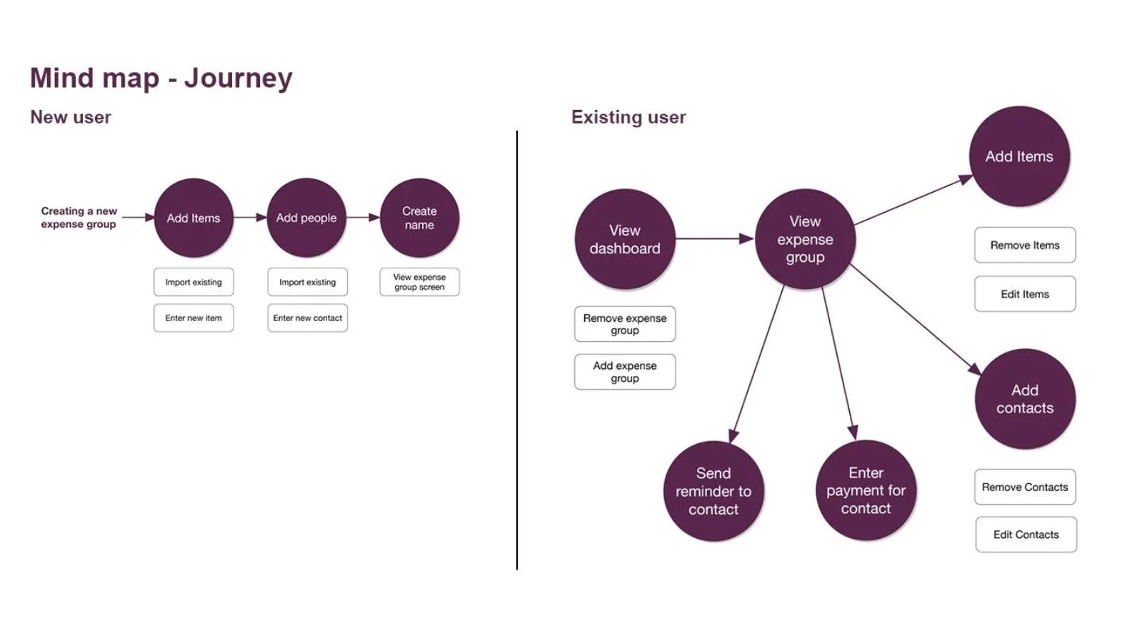
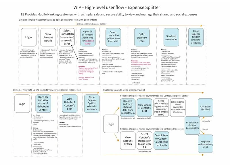
To set the foundation for the first round of wireframes, I created a mind map and high-level journey flow to visualize how both new and returning users would interact with Expense Splitter (view on the right).
This exercise simplified complex scenarios, like adding expenses, inviting contacts, and sending reminders into clear, intuitive pathways that mirrored users’ mental models. By breaking down every action step-by-step, we ensured a structure that would be easy to understand and test early.
Alongside the user journey, I developed a detailed Value Proposition Overview. This artifact connected customer needs (a trusted, frictionless way to split and track expenses) with business objectives (boosting digital engagement and driving adoption of Westpac’s mobile banking features). It also defined clear scope boundaries, helping the team prioritize MVP functionality.
Together, these deliverables gave the team a blueprint for the first wireframes, allowing us to move into rapid prototyping with confidence. They became key alignment tools for product managers, BAs, and engineers, ensuring every screen we designed was grounded in both user insights and strategic goals.
Prototyping:
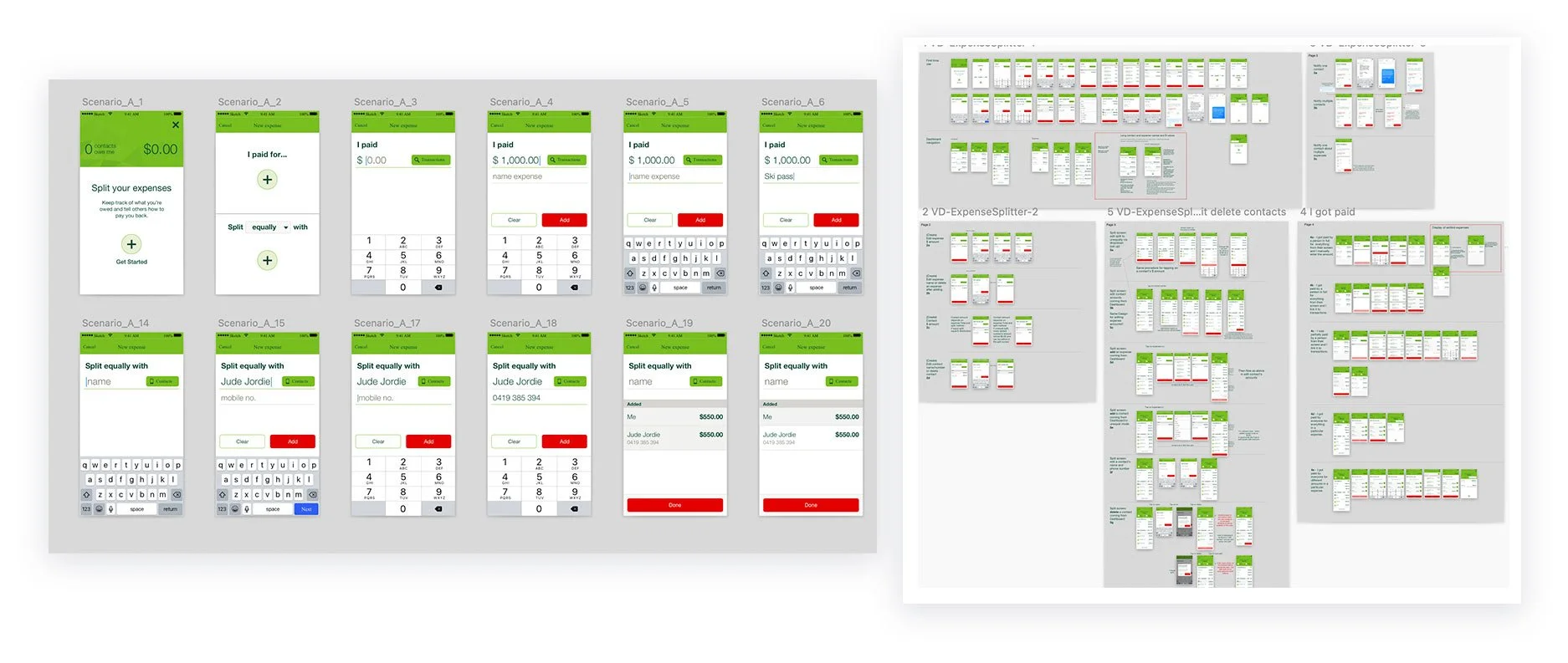
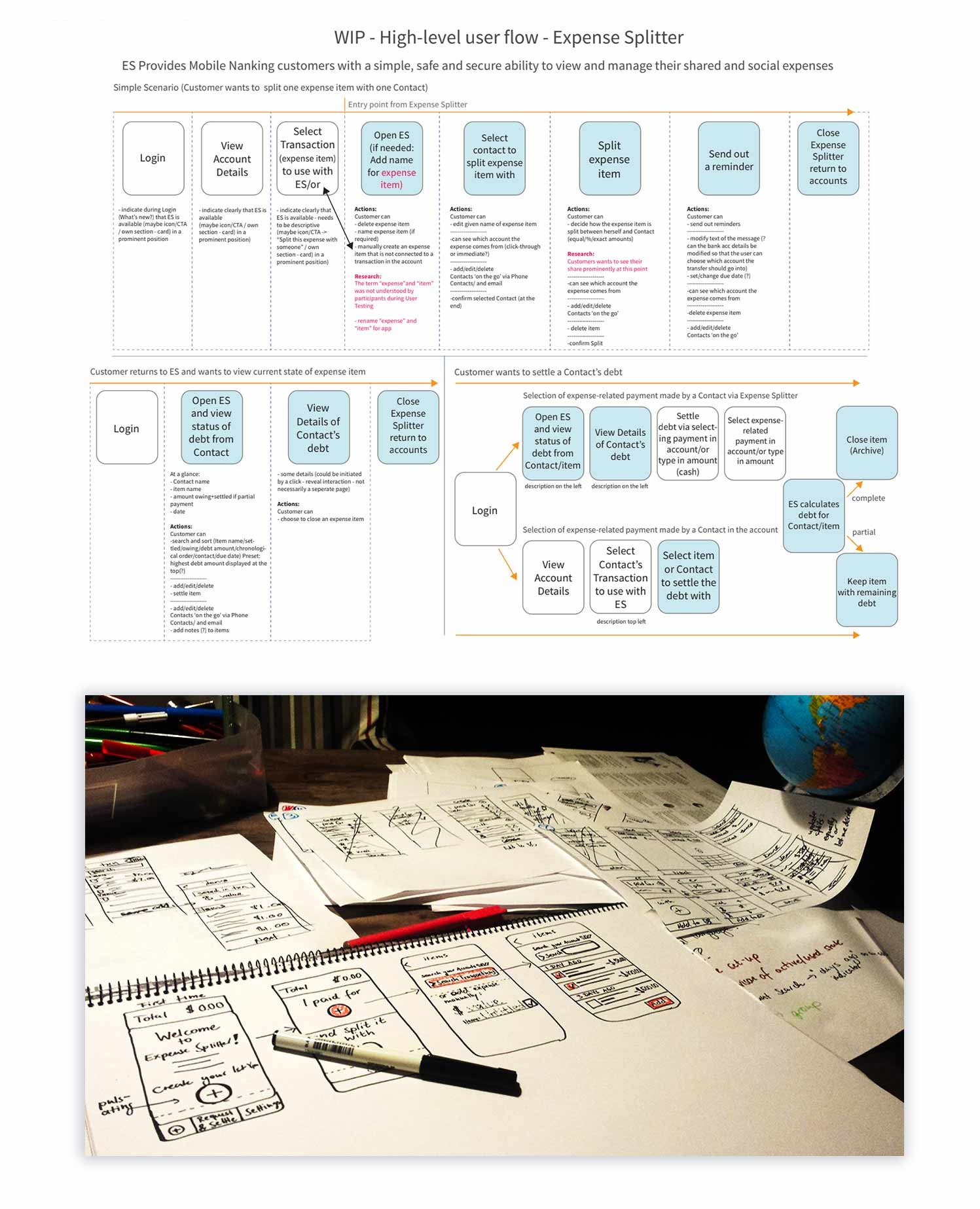
User Flows + Sketches + Early Wireframes
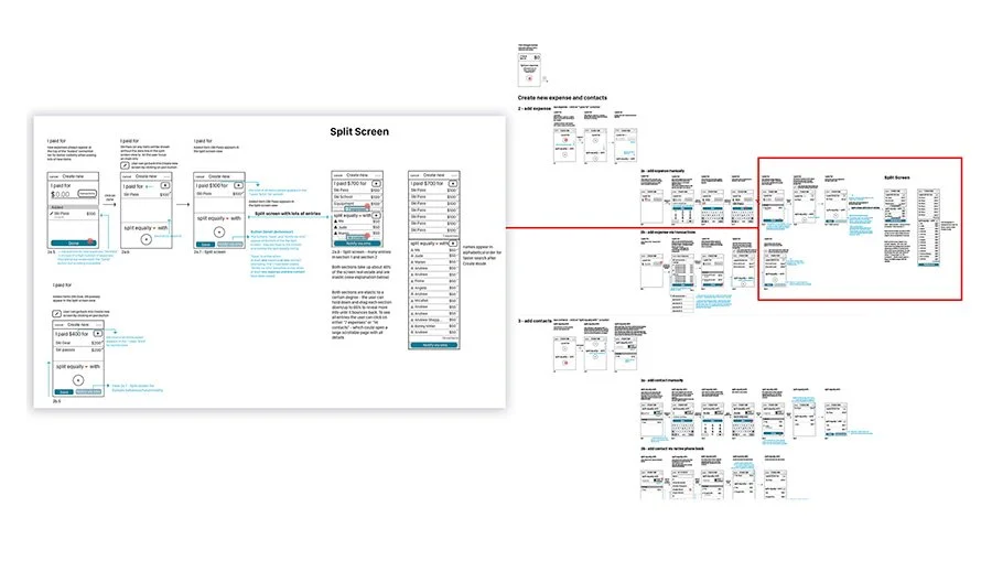
Once the value proposition and user journeys were clearly defined, I translated those insights into high-level user flows to map the complete Expense Splitter experience. These flows illustrated every critical interaction, from creating an expense group to sending reminders or settling debts, and served as a shared reference point for designers, business analysts, and developers. By visualizing scenarios step-by-step, we identified potential friction points early and ensured a seamless path for both first-time and returning users.
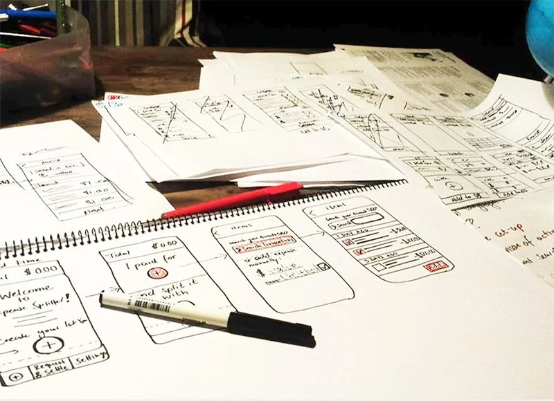
In parallel, I and my co-worker Alison created hand-drawn wireframes to quickly iterate on layout ideas, navigation patterns, and feature placement. These sketches made it easy to test assumptions with internal stakeholders and customers before investing in higher-fidelity prototypes. This combination of structured flows and low-fi sketches gave the team confidence in the direction and allowed us to maintain agility, capturing feedback early and refining concepts rapidly in an agile environment.
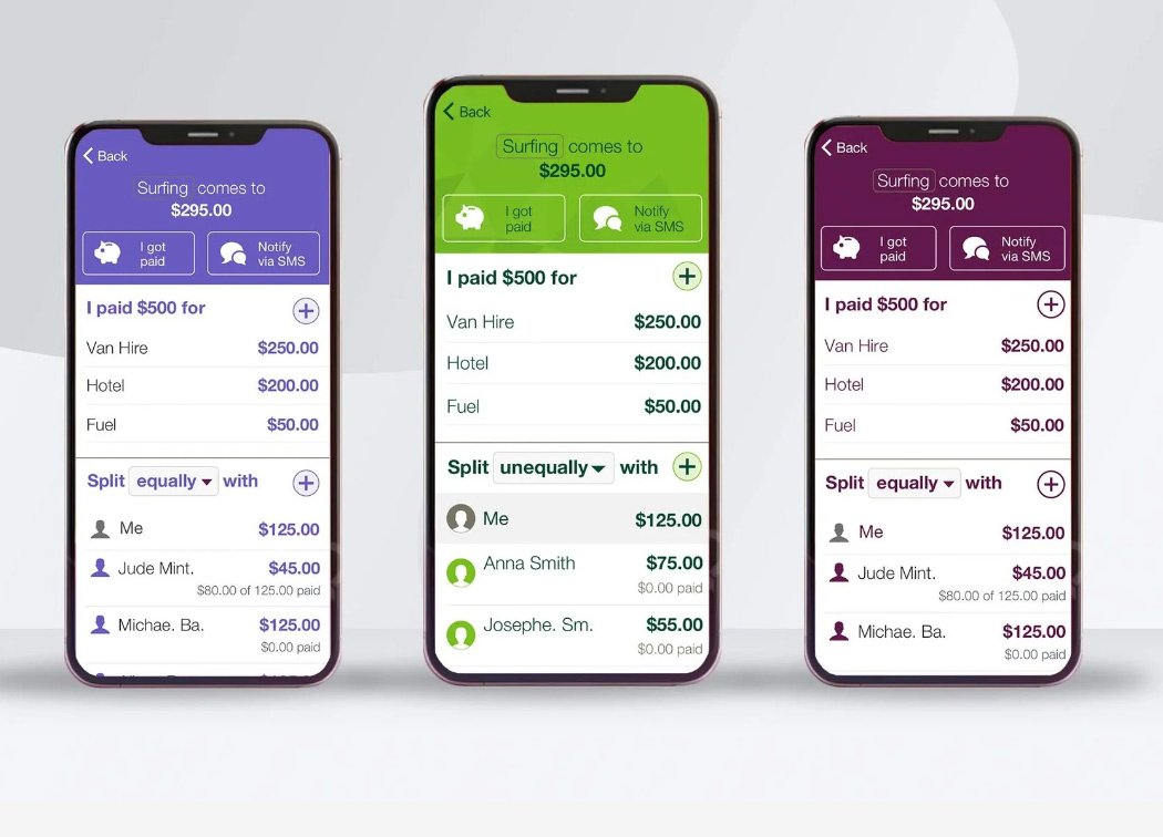
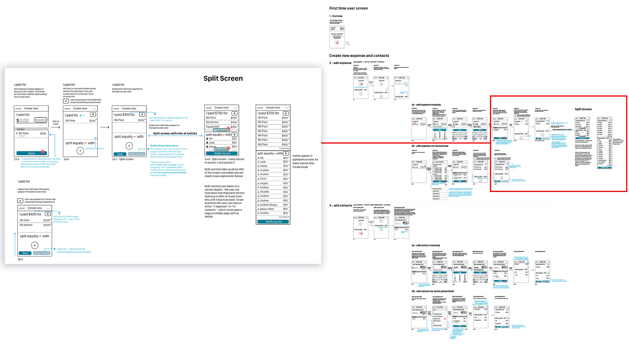
The core of the Interface Design concept utilised a Split screen Design with prominent “Plus” buttons, where the user could easily add one or more expenses in the top half following conversational prompts “I paid for” and the add button, and then split these by adding contacts in the bottom section in the same way. The user can select between splitting expenses equally or unequally.
Wireframes
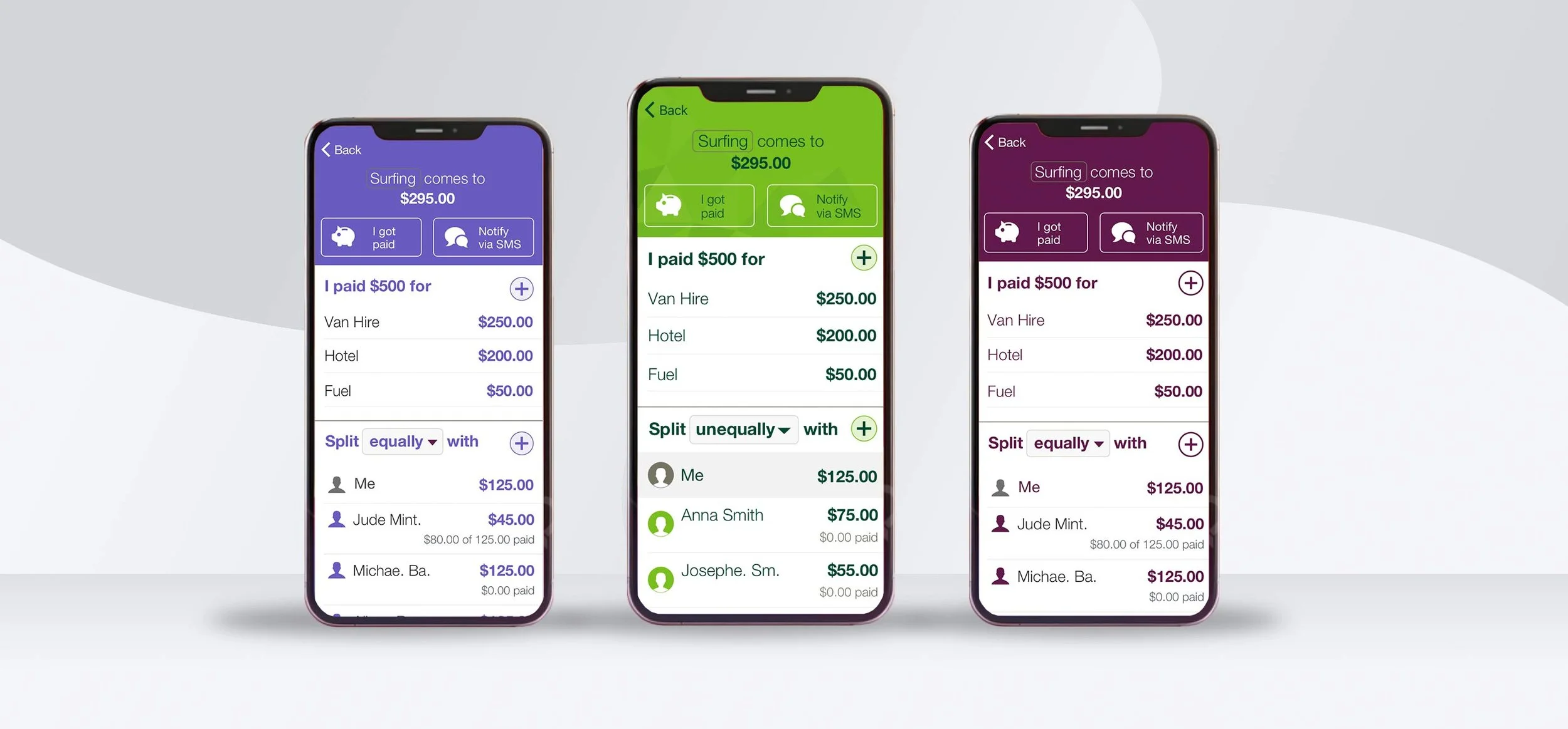
To ensure consistency across Westpac’s brand family, we extended the design system to cover St. George (center) and Bank of Melbourne (left) with the Westpac branding on the right. This umbrella approach allowed the Expense Splitter app to be rolled out seamlessly across multiple institutions while maintaining each bank’s unique brand identity, colours and UI style.
Wireframes and high-fidelity Designs
With a solid foundation of user flows and early concepts, we advanced into mid- and high-fidelity wireframes to shape the finer details of Expense Splitter’s experience. These wireframes emphasized clarity, simplicity, and reduced cognitive load, making sure even complex interactions, like uneven splits or debt settlements, felt natural and intuitive.
We annotated the wireframes extensively, documenting button states, edge cases, and dynamic elements like the Split Screen view. This created a single source of truth for the entire product team.
Once the flows were mapped, we transitioned them into high-fidelity prototypes, pairing a clean visual style with thoughtful micro-interactions to build trust and usability. An external agency then tested these prototypes with 15 Westpac customers, who were tasked with realistic scenarios such as:
First-time setup
Adding contacts
Splitting expenses
Messaging contacts
Tracking repayments
Testing validated the design: customers completed tasks quickly and confidently, confirming that the interaction model aligned with their mental model of splitting expenses. All sessions were recorded, and we observed them live to capture feedback. Remarkably, all participants said they would recommend the app, achieving an NPS score of 10.
Following the successful testing phase, I presented all low-fidelity flows, printed on two large movable walls, to a team of 25 Westpac developers in Kogarah, answering questions about edge cases, exceptions, and text/name truncations. Over the next six weeks, I worked closely with two supporting designers to refine wireframes and transition screens into final, implementation-ready designs.
This stage marked a critical turning point, where the concept moved from hypothesis to a polished, development-ready product, with every detail: visual, functional, and emotional, carefully considered.
Expense Splitter - St. George Bank example First Time flow and Birds eye view of some flows