Teresa Serrao Architects
Branding & Visual Identity
Design Gallery

Project Overview
Teresa Serrao Architects is a full-service architecture practice focused on creating energy-efficient, environmentally responsible residential homes. The brief was to craft a brand identity that reflects the studio’s sustainable values, personal approach, and attention to detail. The result is a refined, modern identity grounded in architectural logic and conscious design.
Design Approach
The visual language draws from the rhythm and balance of architectural forms, structured yet warm. The logo mark was designed to be both abstract and architectural, while the palette and typography evoke a sense of quiet confidence. The design process centred on aligning brand expression with Teresa’s values of ecological sustainability, including passive solar design, recycled materials, and low-waste construction practices.
Target Audience
The brand speaks to clients seeking high-quality, bespoke residential architecture with an emphasis on sustainability. This includes homeowners planning renovations or new builds, often with families or professionals interested in long-term livability, energy efficiency, and thoughtful design solutions.
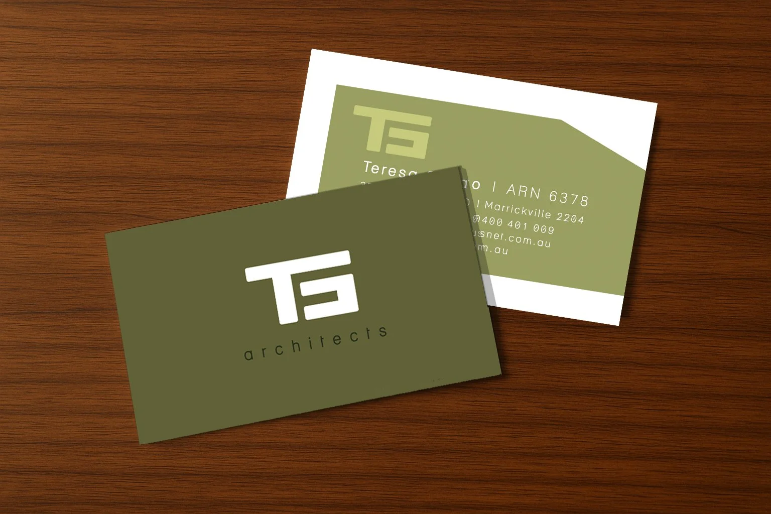
Logo & Businesscards
At the heart of the brand is a custom-designed logo mark inspired by architectural fundamentals—balance, structure, and intentional space. The initials T and S are integrated into a monolithic, geometric form, echoing floorplans and façades to reflect the client’s sustainable, thoughtful design ethos.
The business cards feature a deep forest green background and the bold logo mark, symbolising structure and growth. The reverse embraces white space and clean typography. Printed on uncoated, recycled stock, they embody the studio’s commitment to eco-conscious, high-quality design.
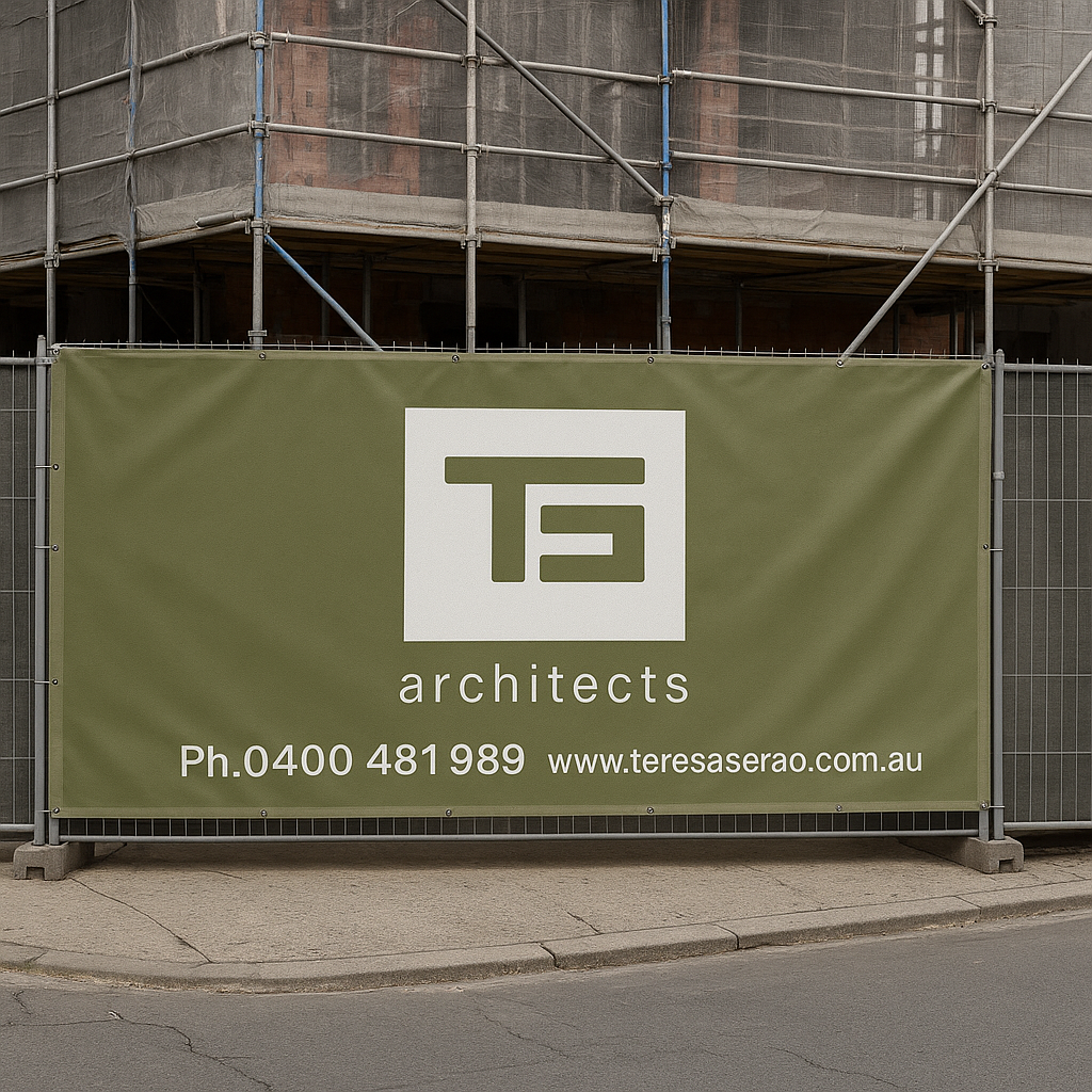
Construction Fence Banner
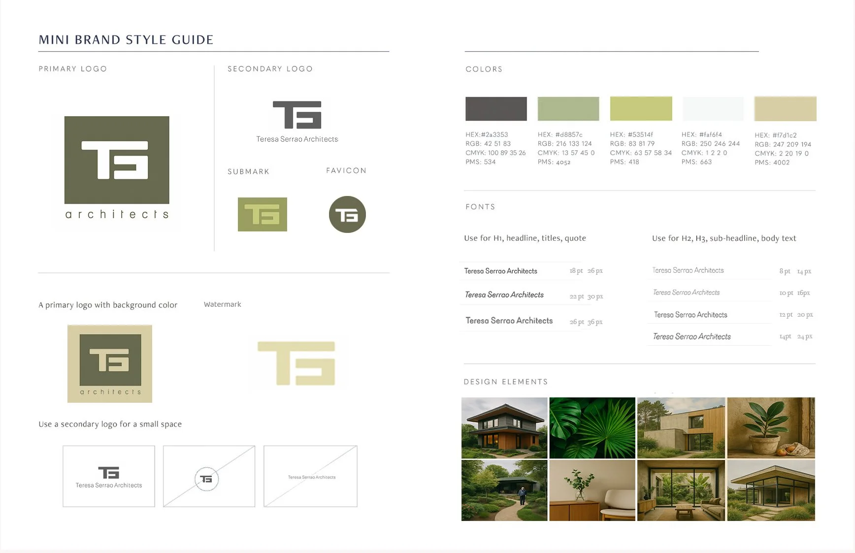
To ensure consistency across all applications, I developed a concise visual style guide. This included:
Primary and secondary colour palettes drawn from natural materials – olive greens, clay tones, and off-white hues.
Typography pairings selected for their clarity and architectural personality: a serif for structure and sophistication, a sans-serif for warmth and legibility.
Guidance for logo usage, spacing, and tone – providing Teresa Serrao Architects with a cohesive visual language that mirrors their design ethos.
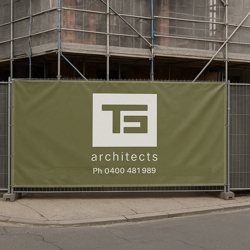
Construction Fence Banner
The banner was designed for high visibility on building sites, reinforcing the brand in the public domain. The layout balances brand recognition with a clean, professional presence. Durable, weatherproof materials were chosen to align with the practice’s values: long-lasting and made from recycled materials.
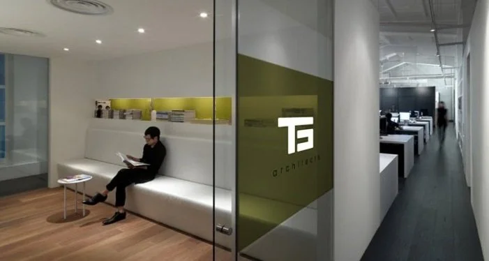
Glass Wall Decal
Installed on an interior glass partition, the frosted decal features the logo mark as a subtle architectural feature. It enhances privacy in the office while functioning as a refined branding moment. Its simplicity complements the studio environment without distraction, creating a space that reflects clarity and focus.

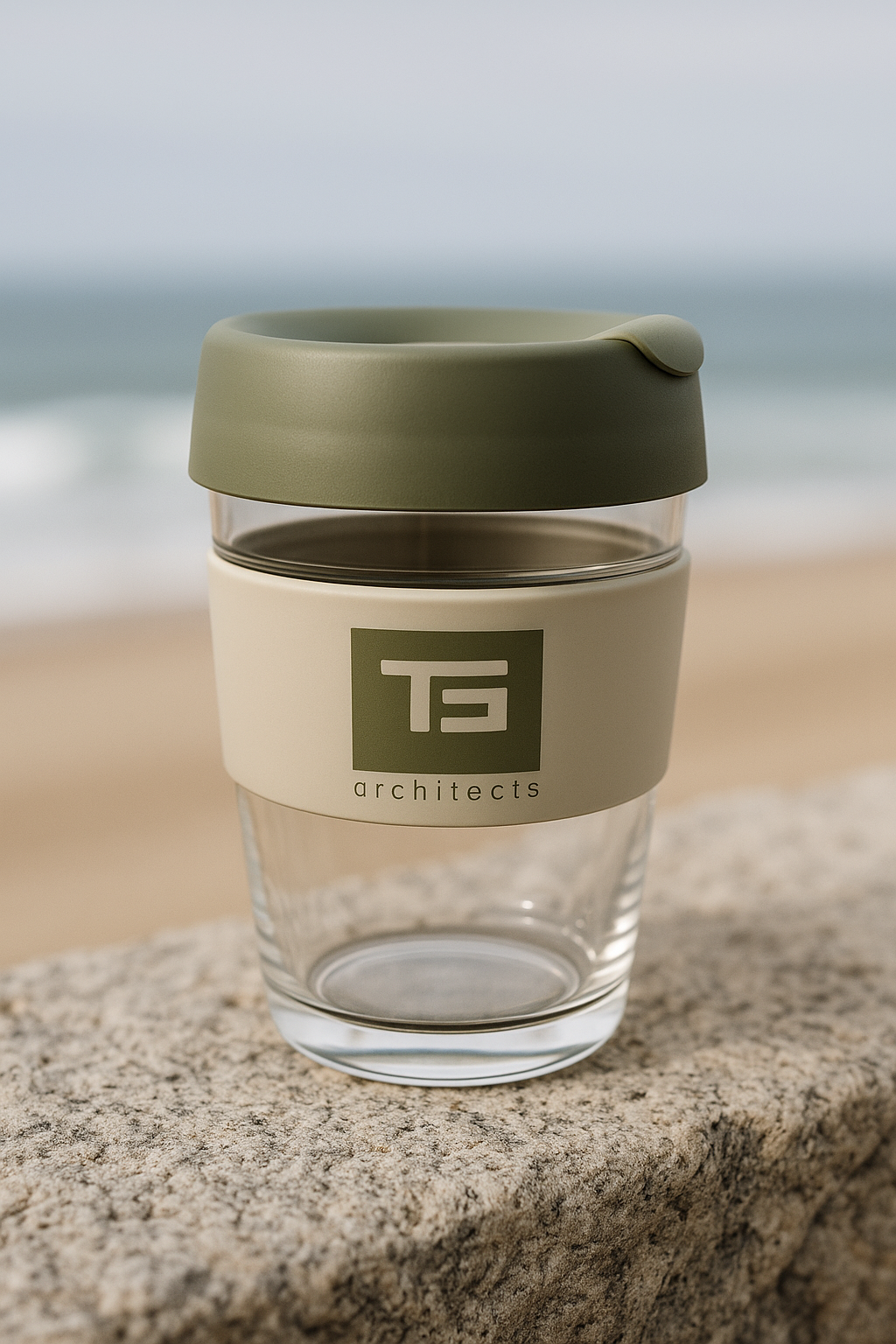
Keep Cup
As a sustainable brand touchpoint, the Keep Cup was custom-designed using the studio’s brand colours and mark. It serves as a daily-use item for Teresa and her clients, reinforcing the practice’s commitment to low-waste living and practical sustainability in even the smallest details.
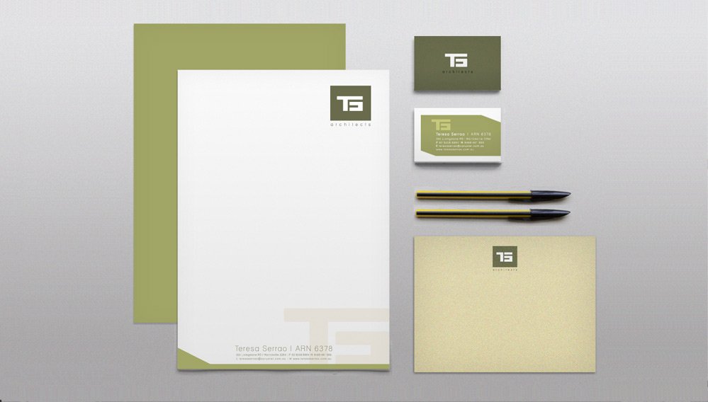
Stationery Suite
Installed on an interior glass partition, the frosted decal features the logo mark as a subtle architectural feature. It enhances privacy in the office while functioning as a refined branding moment. Its simplicity complements the studio environment without distraction, creating a space that reflects clarity and focus.
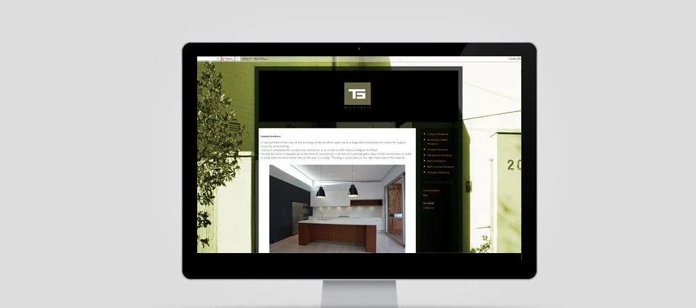
Website (WordPress)
Built on WordPress, the responsive website showcases the studio’s portfolio, philosophy, and service offering. The design prioritises user experience and elegant simplicity, with a focus on showcasing imagery and clean navigation. The site was handed over with a custom guide, enabling the client to make future updates with ease, choose their domain and provider.