Product/UX Design | Noggin - SaaS platform
Design & Strategy
Design Gallery
Noggin 2.0: Redesigning a Critical Incident Management Platform
A modular, user-centered redesign that transformed usability and adoption for Noggin, the award-winning resilience and incident management software.
Design Approach
The Challenge
Noggin’s original platform, Crisis, was feature-rich but had critical barriers:
Rigid workflows and heavy consultant dependency.
Not mobile-ready, which made real-time crisis response difficult.
Poor user adoption due to low customization options.
With customers including Sydney Airport, Red Cross Australia, and major universities, Noggin needed a modern, mobile-ready version that empowered teams to manage complex incidents in large teams customised for their needs.
My Role
As the Lead UX Designer on a cross-functional agile team of 12, I was responsible for:
Led research, personas, and journey mapping.
Designed a scalable, component-based design system across web and mobile.
Directed the redesign of dashboards, widgets, launchpads, and incident timelines.
Ran usability testing cycles and validated designs with our clients
Delivered a platform experience that scales, with workflows tailored to critical safety sectors
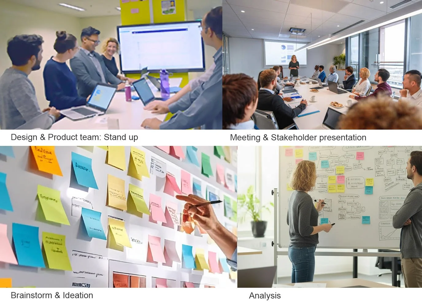
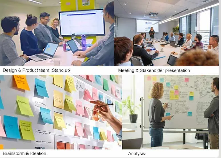
Discovery & Insights
Through research and interviews with safety managers, emergency planners, and corporate security teams, we uncovered key insights:
Workshops and user shadowing: Teams revealed that no-code customization was critical to reduce dependency on consultants.
Real-time visibility: Incident managers needed dashboards that could surface actionable data across multiple streams quickly.
Frictionless communication: Teams valued transparent, live updates, especially during crisis response.
Over months of research, interviews, analytics reviews, and iterative feedback loops, we mapped detailed user journeys and built proto-personas representing our primary sectors: Financial Services, Healthcare & Hospitals, Manufacturing and Public Safety & Government.
These became the foundation for every design decision, ensuring we built for real-world workflows.
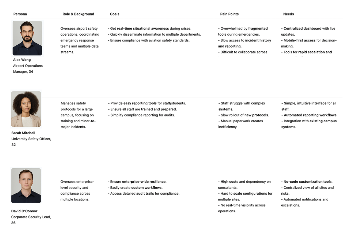
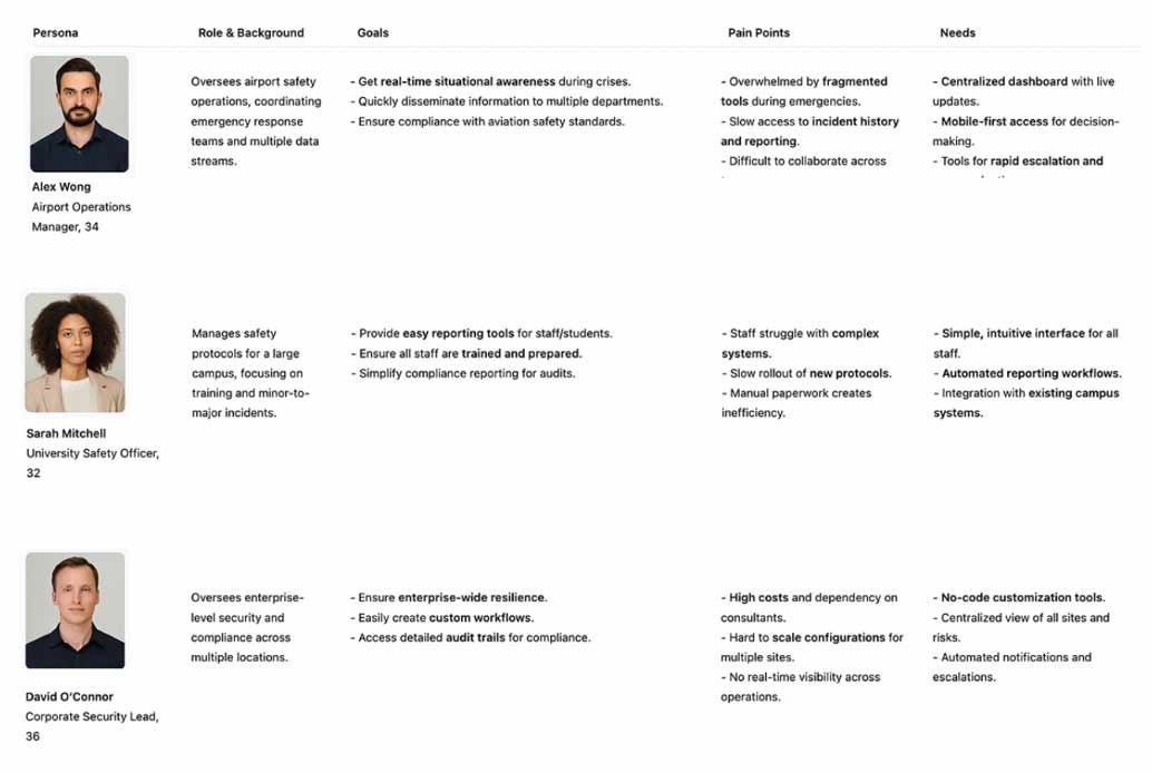
Personas
We created proto-personas to visualize the diversity of Noggin’s users and highlight sector-specific needs. On the left are 3 sample personas.
Depending on the industry we often tried to cover 3 roles (Manager, Team member, on the ground Volunteer) - and focus on their goals, pain points and needs.
Alex: Airport Ops Manager: Needs a fast, intuitive dashboard during emergencies.
Sarah: University Safety Officer: Prioritizes ease of reporting for non-technical staff.
David: Corporate Security Developer: Requires scalable, compliant workflows.
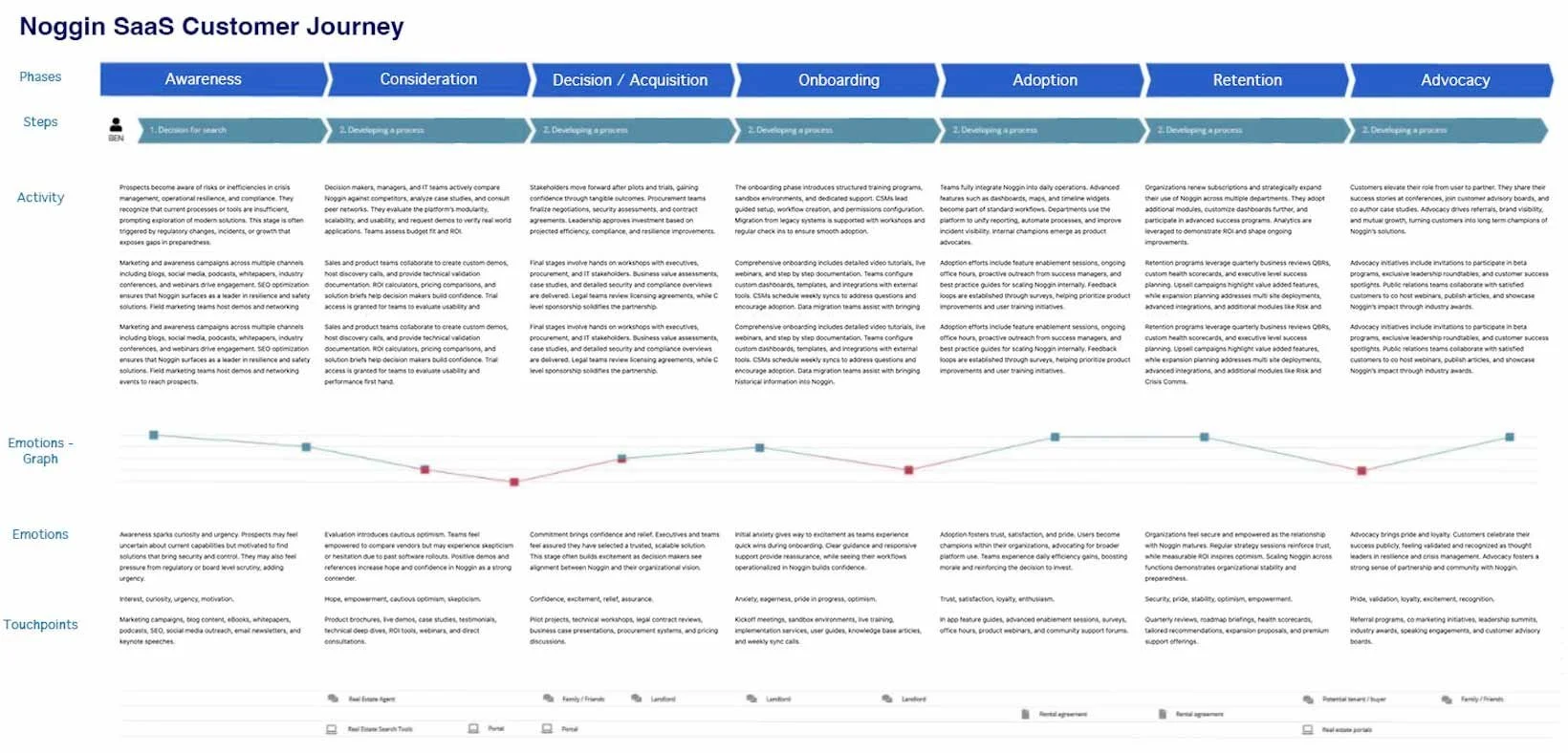
User Journey Mapping
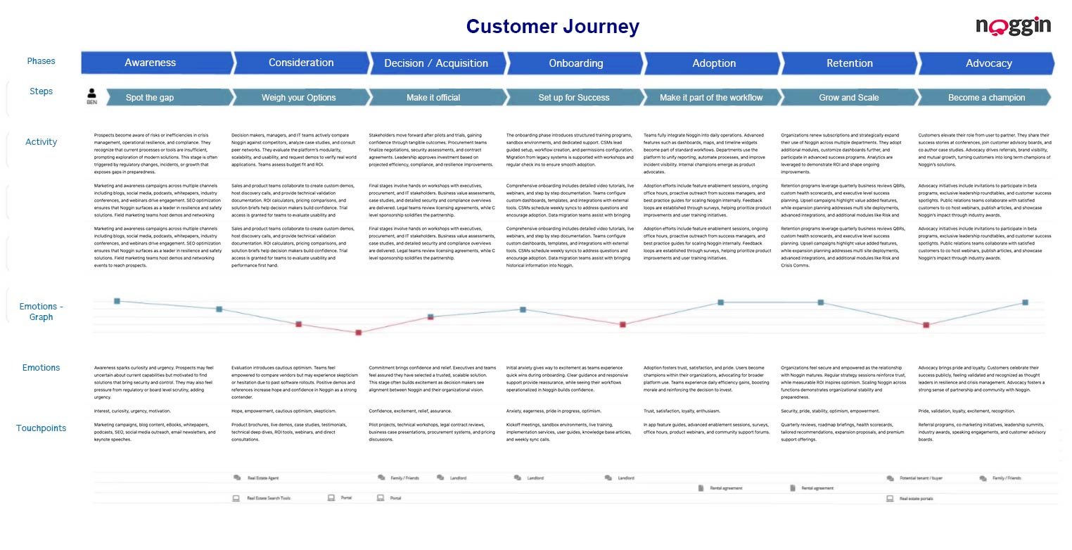
To truly understand user experiences, we developed a Customer Journey Map that visualized the full lifecycle, from Awareness to Advocacy. Each phase showed user emotions, goals, and pain points, helping us identify where users struggled and how to guide them through onboarding, adoption, and advocacy.
For Noggin, journey mapping became a strategic tool:
We uncovered gaps in onboarding and areas of high friction in the legacy system.
We aligned cross-functional teams, product, UX, marketing, and customer success around a single narrative.
We designed for critical crisis moments where time, clarity, and trust matter most.
The CJM guided design sprints over more than 3 years, shaping features like mobile dashboards, dark mode, and rich communication tools for incident managers (including support for video, images, and real-time updates).
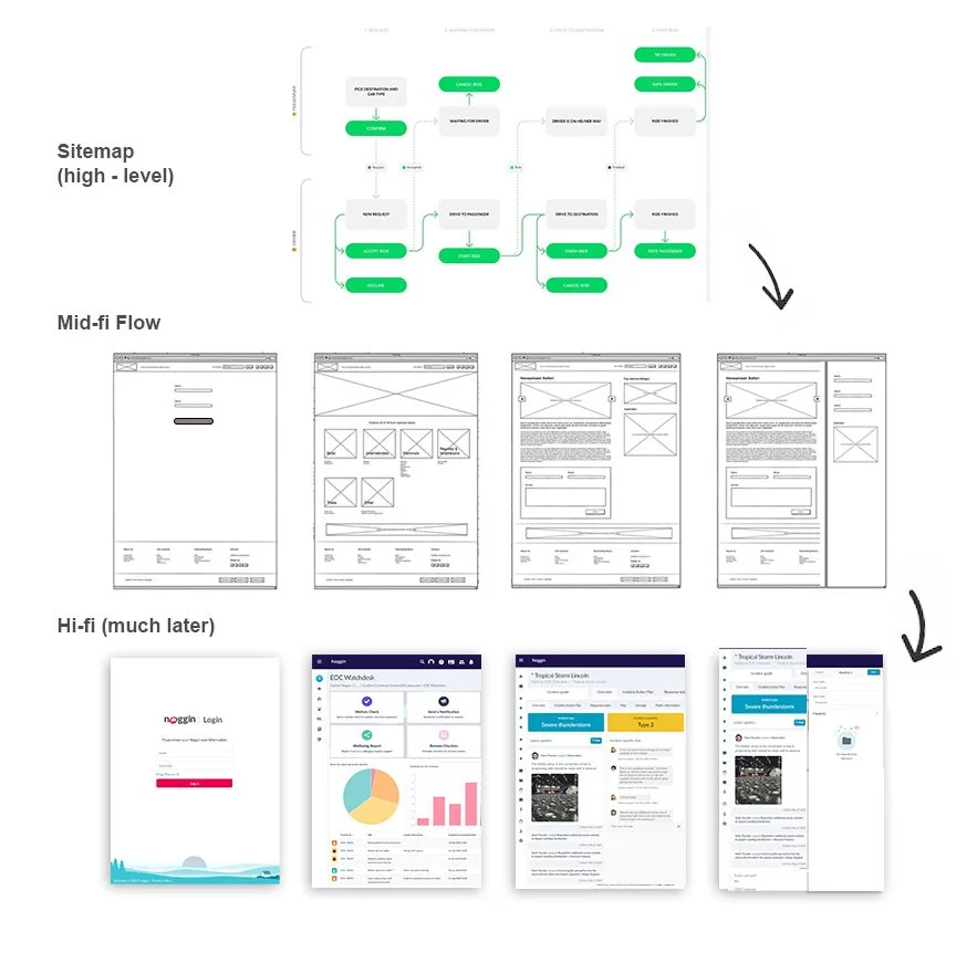
Design Process
Our approach combined iterative design and hands-on testing:
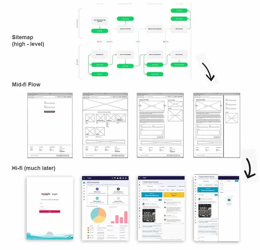
Wireframes >> Mid-fi >> High-fi Prototypes built in Axure and Sketch based on sitemaps for various initiatives .
Early usability tests validated the “Lego-like” component model, users could assemble workflows and dashboards without dev support.
Created a comprehensive style guide with UI patterns, accessibility standards, and branding.
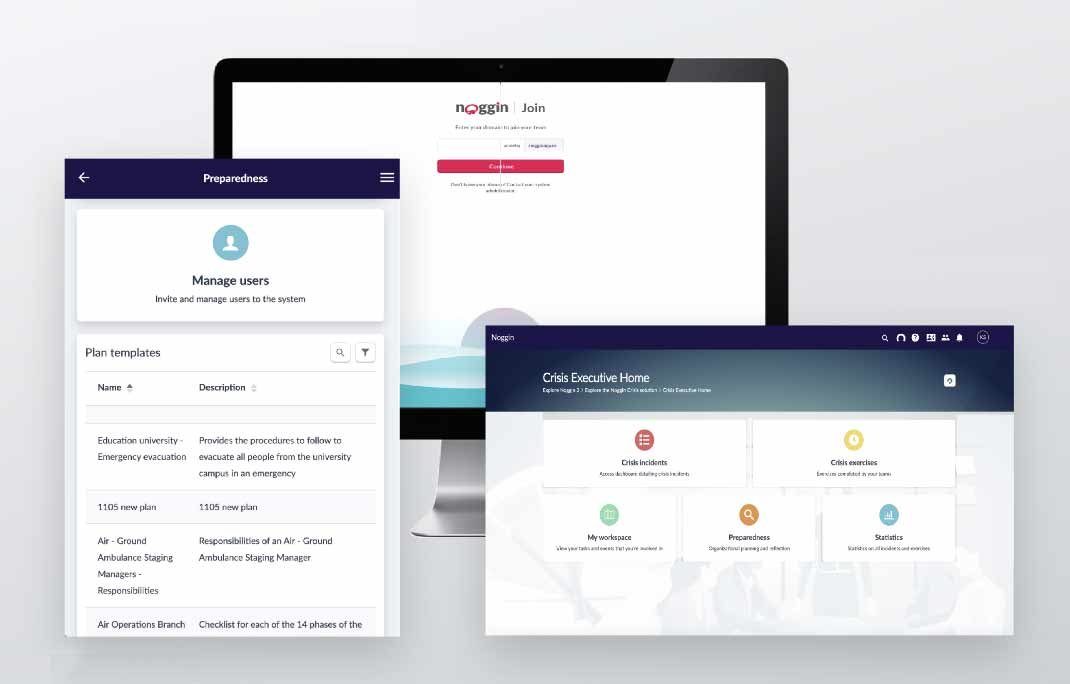
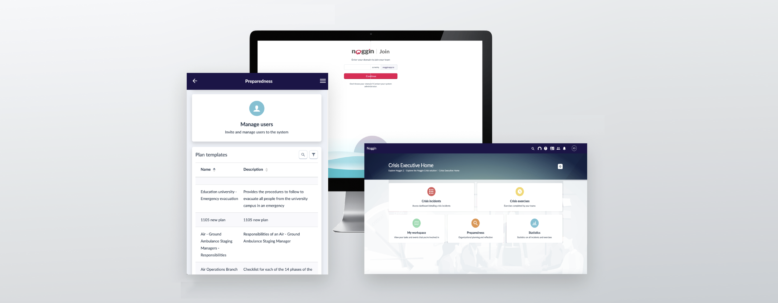
We started with the simplest use cases to build user trust and validate the component system, on the right is a tablet format example for Login - Dashboard - Detail view - additional view in a sidesheet.
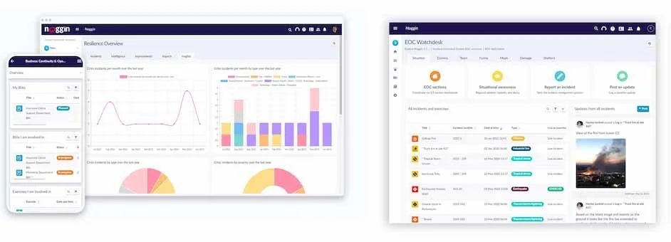
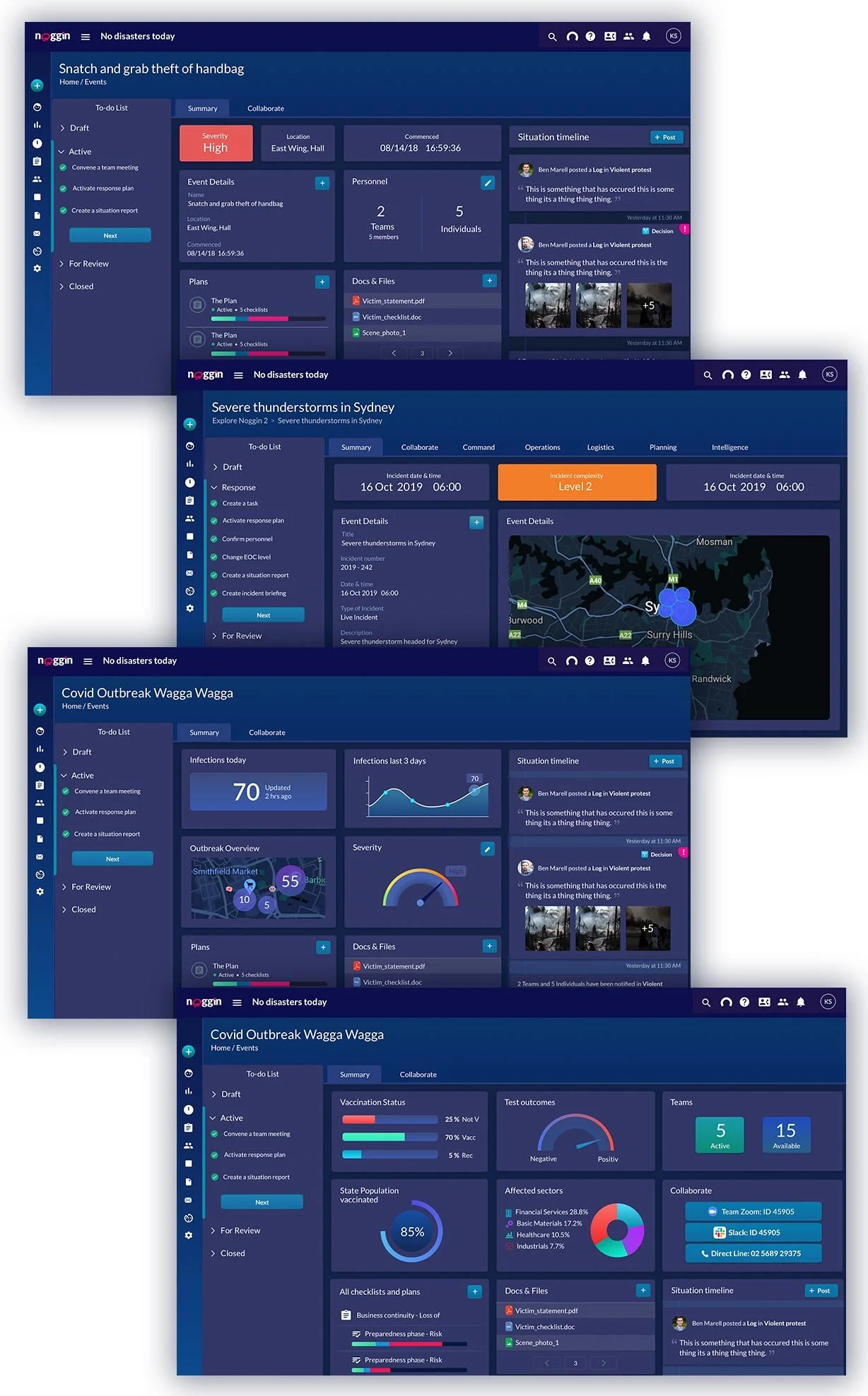
Early Dashboard widgets focused on a single piece of information as a proof of concept, like COVID-19 infection numbers, giving users immediate access to critical stats. From there, we expanded to more complex widgets: Event Information panels for quick situational insights, interactive Maps to provide geospatial context, complex plans with attached checklists and Timelines for visualizing incident progression.
We tested each widget and initiatives in it’s mid-fi Design on existing users and learned and implemented adjustments every 4 weeks before continuing with High-fi work. Apart from User testing, we also utilised card-sorting activites and qualitative interviews in order to build relevant software for Risk managers, Team members and Analysts.
This incremental, user-driven process ensured every component was intuitive, tested, and resilient before scaling up.
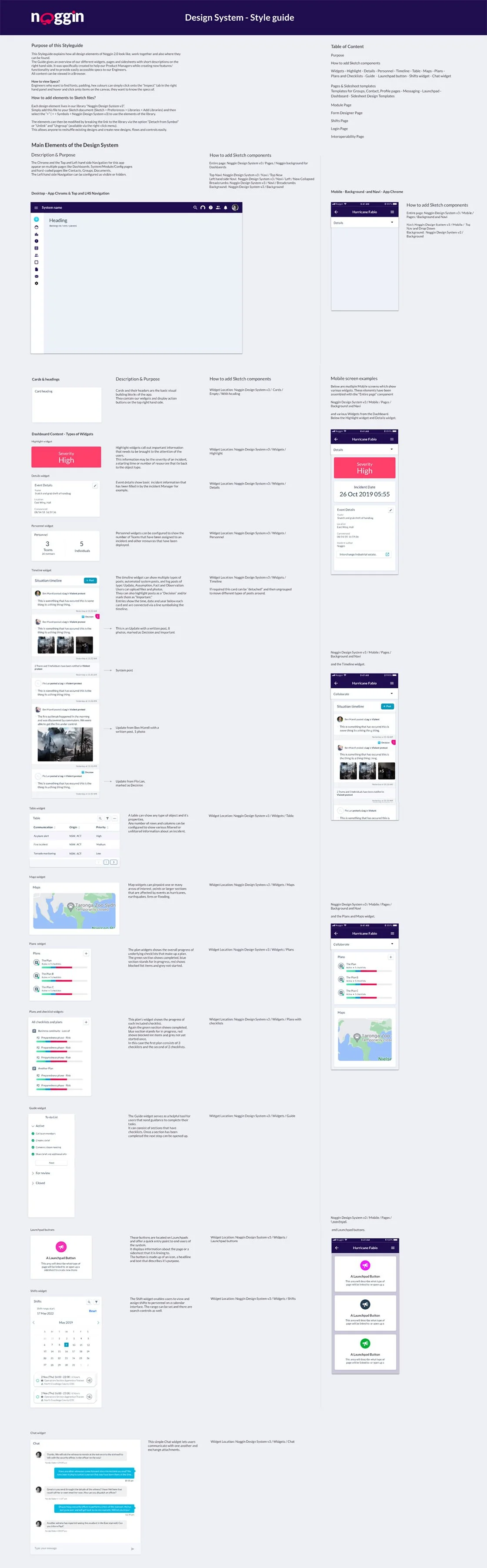
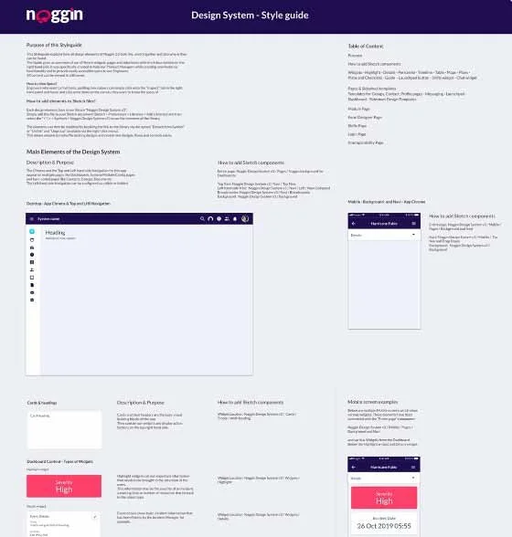
Style guide/Design System
To support scalability and consistency across Noggin’s platform, I created a comprehensive styleguide that served as a single source of truth for all design decisions.
This system that referenced the Design system detailed every component, from navigation bars, application chrome, and foundational layout patterns to highly specific elements like highlight and detail widgets, interactive timelines, dynamic tables, plans and checklists, and integrated chat modules.
Each component was designed to be modular, accessible, and easy to configure, enabling teams to quickly adapt the product to different industries and use cases.
The clear documentation and visual guidelines allowed Product Designers and Business Analysts to prototype and iterate new features up to 40% faster once the guideline was finished, while drastically reducing inconsistencies.
By building reusable design elements, typographic systems, and interaction patterns, we ensured smooth handoffs between design and development, reducing rework and accelerating delivery. Over time, the styleguide evolved into a living design system, empowering cross-functional collaboration and supporting a rapid, user-centered design workflow across multiple projects.
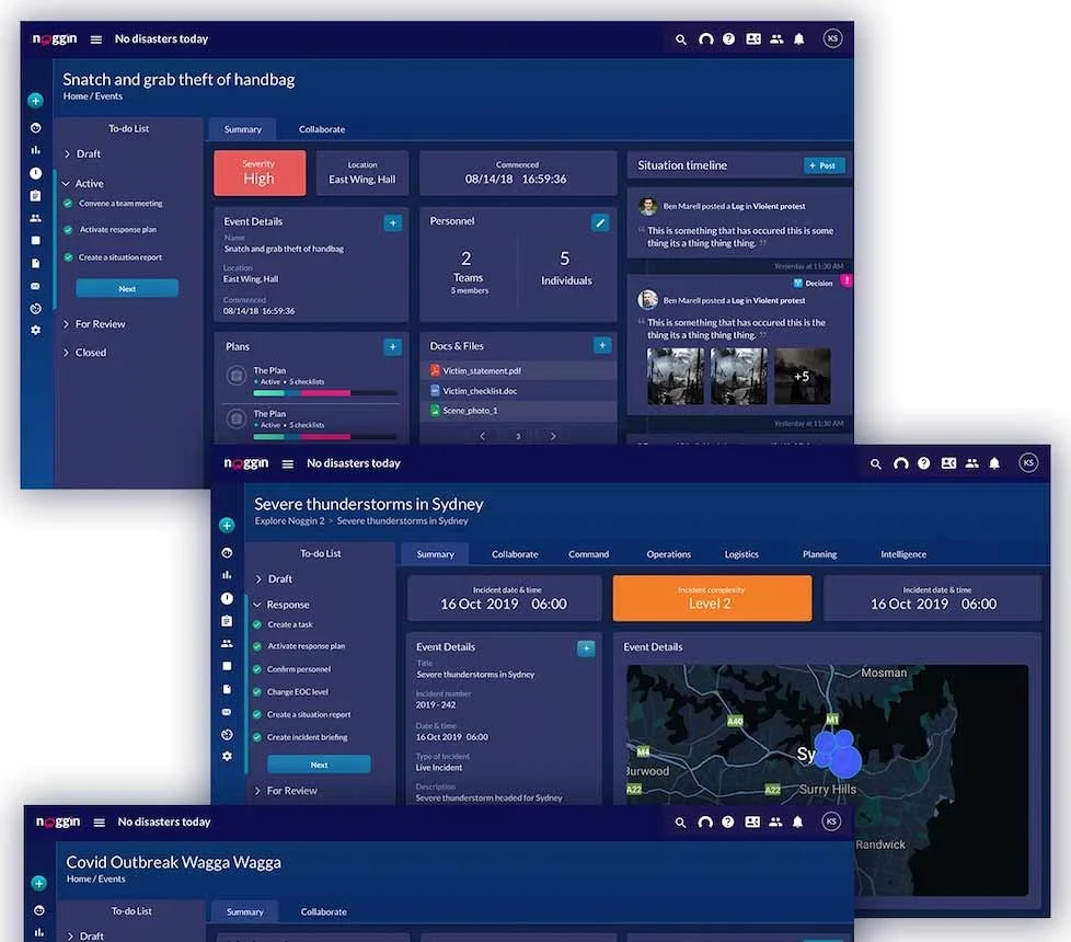
Dark Mode (below)
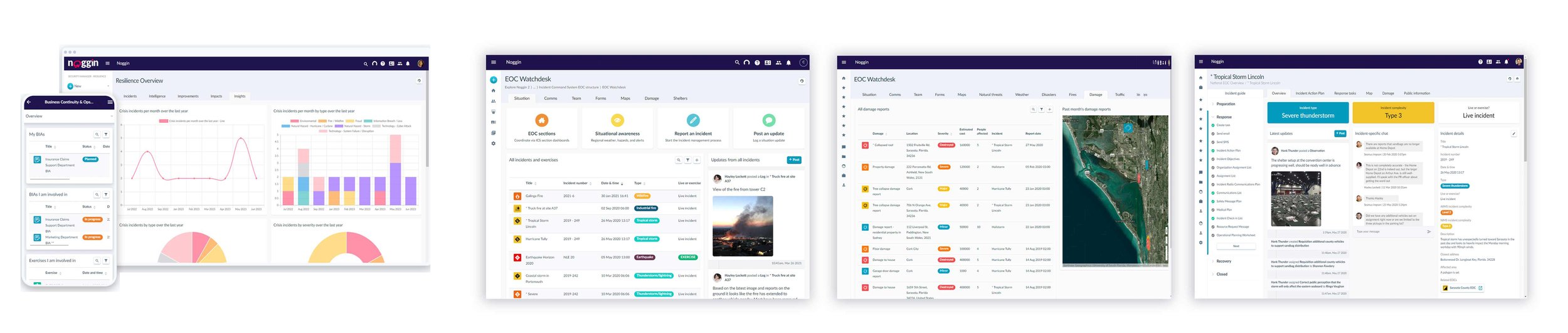
Building on the styleguide, we prioritized flexibility and accessibility, ensuring the platform could meet the diverse needs of teams working in high-pressure environments.
One key feature was the introduction of a Dark Mode, designed specifically for night-shift operators and control room teams who needed to monitor critical incidents for extended hours. Research showed that reducing screen glare and visual fatigue improved accuracy and comfort during overnight operations.
I also introduced new visual indicators, including gauges, graphs, and highlighted timeline posts, to make critical updates stand out and improve situational awareness. By pairing these enhancements with a fully accessible dark theme, organizations could customize their workspaces without compromising usability, brand consistency, or speed of decision-making.
Company Evolution & Achievements
What began as a complete redesign of Noggin’s platform grew into a collaborative, user-centered transformation. Our cross-functional team of UX designers, product managers, developers, and business analysts worked hand-in-hand to create a platform that not only met operational needs but also exceeded user expectations. Every design choice—from a “Lego-like” component model to dark mode for control room teams—was validated through user research and testing, ensuring practicality, speed, and confidence in high-stakes environments.
The results were immediate: Noggin’s user base grew by 25% in the first 2 years after go-live, with customer satisfaction scores climbing and adoption rates soaring. The platform became a trusted global resilience solution, used by emergency services, aviation, higher education, and corporate security teams worldwide.
This success led to Noggin’s acquisition by Motorola Solutions in 2024, marking a major milestone in its journey.
The platform has since earned multiple industry awards, including:
Continuity & Resilience Innovation and Best Continuity & Resilience Provider at the BCI Europe Awards 2024.
Placement in the Leaders’ Quadrant of Verdantix’s Operational Resilience Software Report, with the highest overall score.
BCM Planning Software of the Year by CIR Magazine.
These achievements reflect more than just technical excellence; they are a testament to collaborative teamwork, a relentless focus on user-centered design, and a world-class development effort that turned a complex SaaS platform into an intuitive, indispensable tool for mission-critical industries. Today, Noggin stands as a shining example of how design, engineering, and business alignment can create lasting impact at scale.