Product - Space Cube | Desk Organiser
Visual Identity
Design Gallery
Project Overview
The Space Cube is an innovative modular storage brand offering stylish, sustainable solutions for modern homes and workspaces. The brief was to develop a brand identity that reflects its functional elegance, eco-conscious values, and focus on intelligent design. The result is a sleek, minimal identity system built around modularity, clarity, and purpose.
Design Approach
The visual identity is inspired by the clean geometry of storage systems and the simplicity of Scandinavian design. The cube mark serves as a bold visual anchor—both literal and conceptual—while the typography and colour palette express efficiency and calm. The design process emphasised alignment with The Space Cube’s commitment to sustainable materials, considered functionality, and a more intentional way of living.
Target Audience
The brand appeals to design-conscious individuals seeking smart, sustainable storage solutions for home or office. This includes professionals, creatives, and families who value functionality, aesthetic clarity, and environmentally responsible design. They are often looking to simplify their spaces without compromising on quality, style, or thoughtful organisation.
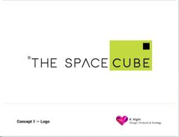
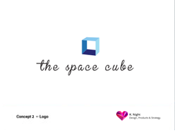
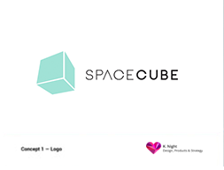
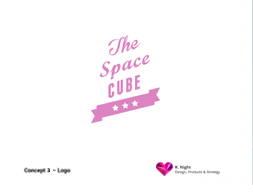
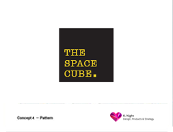
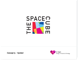
Logo Concepts
The following concepts explore a wide visual range to position The Space Cube in a way that balances personality with clarity. Each design direction investigates a unique tone, from minimalist and contemporary to playful, vintage-inspired, or tech-forward, allowing the brand to flex across different potential markets and consumer touchpoints.
The aim was to experiment with how the brand could be expressed through different typographic voices, colour palettes, and structural forms, while still maintaining a connection to the core idea of modularity, space, and intelligent organisation. Some concepts lean into bold geometric forms and contrast (Concept A, Concept F), while others explore a softer, more boutique tone (Concept B, Concept D, Concept H).
The diversity in style and visual expression helped spark conversations around what aspects of the brand's values should lead visually—whether it’s smart function, sustainability, elegance, or simplicity.
These early explorations served as a strategic foundation, not only for defining the final logo but also for shaping the tone of voice, visual hierarchy, and broader identity system that followed.
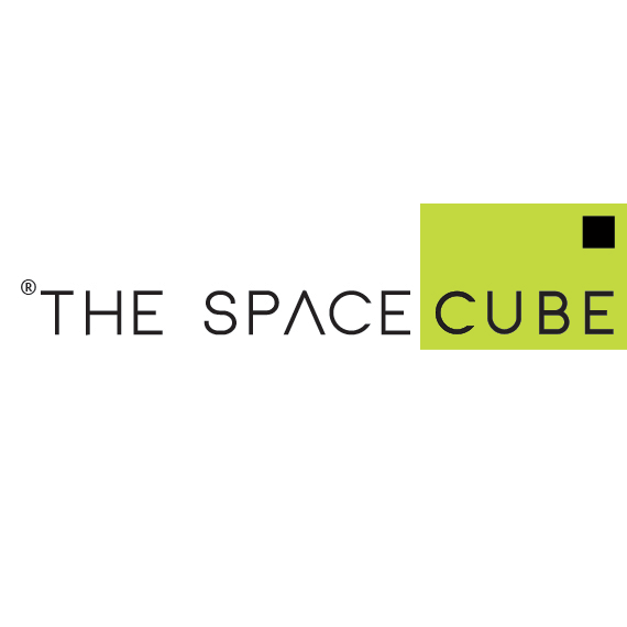
The final Logo
The final logo for The Space Cube reflects modernity and smart design. The clean, geometric typography is balanced by a striking lime green cube, anchoring the identity with a sense of structure and simplicity.
The subtle shift in the letter “A” and the bold contrast between black and green communicate innovation and modular thinking. This minimalist yet distinctive mark aligns perfectly with the brand’s focus on stylish, functional storage solutions for modern living and working spaces.
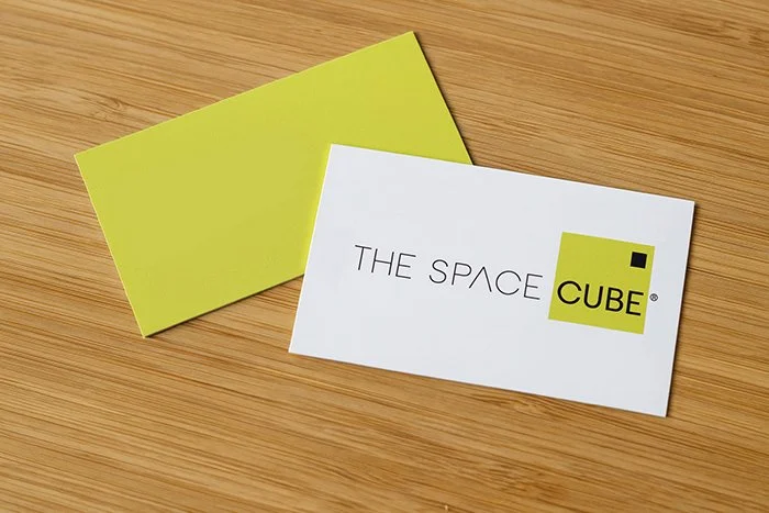
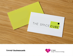
The Business Cards
The business cards for The Space Cube reflect the brand’s clean, modular identity with a refined and modern execution. Featuring the signature lime green square and minimalist black typography, the layout balances space, clarity, and visual impact. The front highlights the logo confidently on a crisp white background, while the reverse side uses solid green for bold contrast. Printed on uncoated stock for a tactile finish, the cards convey smart design and sustainability in one elegant touchpoint.
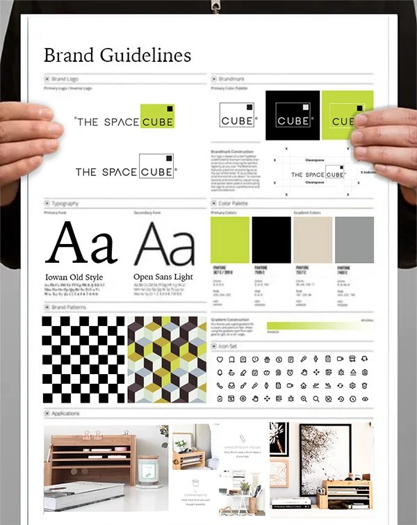
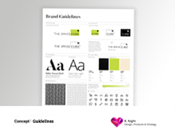
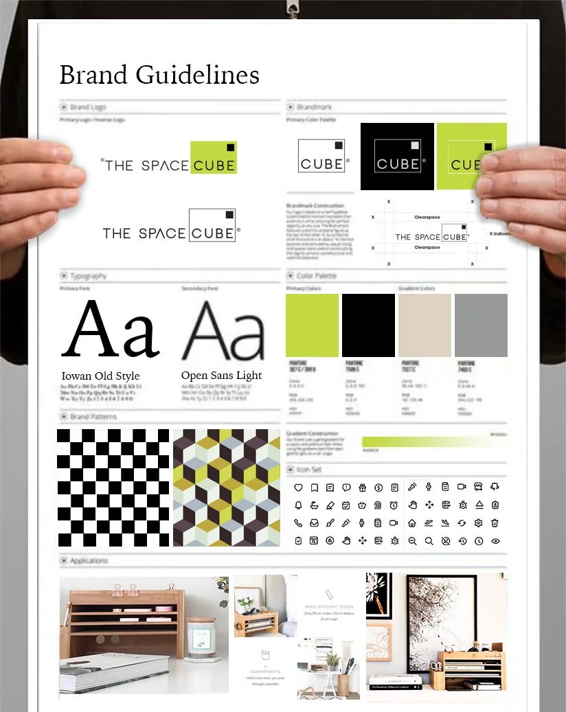
Brand Guidelines
The brand guidelines for The Space Cube establish a clear, cohesive system that communicates the brand’s identity across all touchpoints. The document outlines logo usage, colour palette, brandmark construction, and typography, combining Iowan Old Style with Open Sans Light for a balance of tradition and modernity. Core and gradient colours are supported by brand patterns inspired by modular and cubic forms. Professional photographs were selected and retouched to reflect clarity, functionality, and calm. The guide also illustrates real-world applications, ensuring brand consistency across digital, print, and product collateral while reinforcing the values of simplicity, sustainability, and intelligent design..

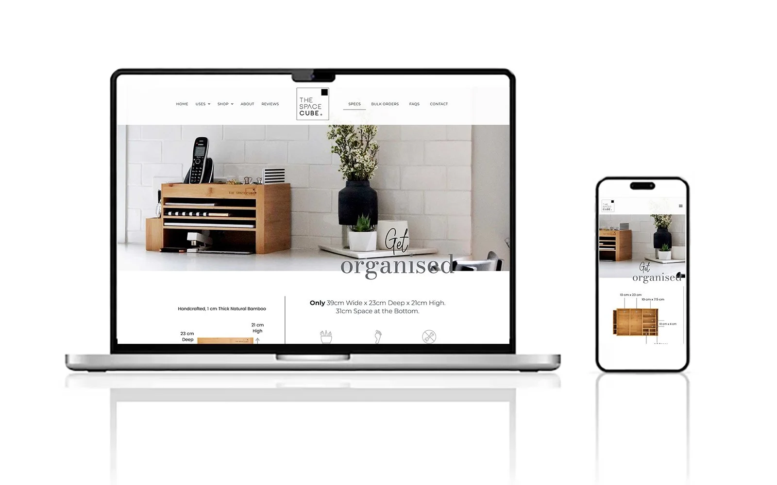
Templates for the website
While the website was developed by an external agency, I provided the overall style direction to ensure consistency with The Space Cube brand. I supplied the brand guidelines and created a custom templates to guide the visual tone across desktop and mobile. I also recommended the product photographer, whose aesthetic aligned with the brand’s clean and minimal look, helping to maintain visual cohesion across digital and print touchpoints.
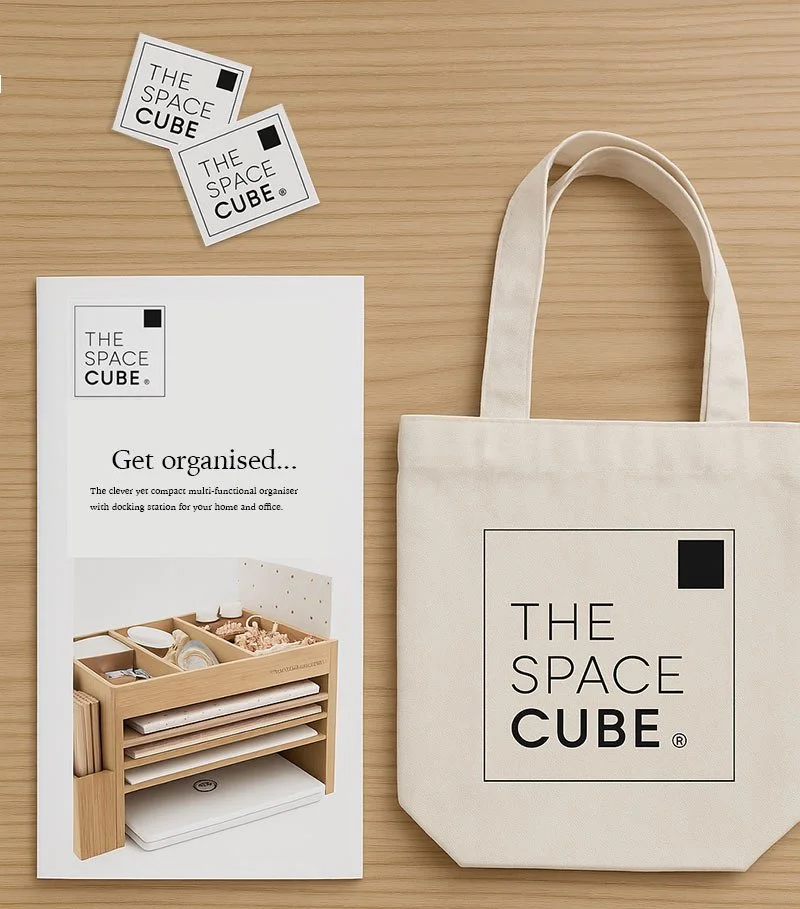
Printed Collateral & Merchandise
This image showcases a cohesive set of branded touchpoints for The Space Cube, including a minimalist product brochure, custom stickers, and a canvas tote bag. Each item reflects the brand’s clean, structured identity, anchored by the signature cube logo and neutral palette.
The natural textures of the bamboo product and uncoated materials reinforce the values of sustainability and simplicity, while the visual consistency across mediums builds brand recognition and trust. Designed to feel both refined and approachable.